
it runs in the family. we are font-picky. truth, we are font-obsessive.
when My Girl was younger and we would make a trip to the library, she would scan along the shelves. with scorn she would scoff at titles – not because of the title, but because of the font used on the spine. “it can’t be any good if they didn’t pay any attention to the font they used,” she’d dismissively roll her eyes.
i am known to go on and on about fonts. d can tell you. i am consistently surprised at how little regard is given to the chosen font in the delivery of a message – a title – a branding. i am often heard saying, “what were they thinking?” and when d can’t relate i text or show 20; i know he will join me in my rant.
we were recently walking in downtown chicago through the neighborhoods heading north with My Boy. we passed by a barnes & noble. glancing over, he derisively declared, “they really need to upgrade their font.” i started laughing when i saw d’s face; i know he was thinking i’m surrounded by them, these font-fussy folks. i couldn’t be prouder.
you have to admit though. you have, at least a time or two, noticed a font and either thought, “wow! i love the way that looks!” or “yuck. that doesn’t fit at all.” you have been on a website where the front page boasts six or seven different fonts, all different colors, no continuity, no crispness. yuck. it’s a mishmash for your eyes and makes you quickly lose interest, likely the opposite of what the site was trying to encourage.
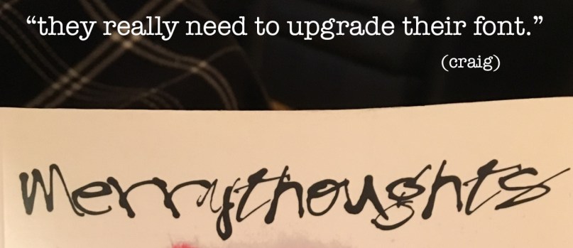
take the title in the image above. a gift, it is literally the title of a book on one of my shelves. offering no opinion on the book itself, i just want to say that based on the font for the title merry thoughts i never would have purchased it. i mean, look at it! does that look merry to you?? it looks more like a halloween font than any kind of merry font. is it sarcastic font? is it tongue-in-cheek font? hardly. that font would have stopped me. boom! no purchase. what were they thinking?
serifs. sans serif. the kerning, the capitalization or lack thereof. the use of punctuation. the color of the font. overuse of italics. bold style vs regular. the amount of clean space. etc. etc. etc. all of it. it all counts.
i love design. inspired from years and years of watching and listening and learning and probably asking too many questions, sitting over the shoulders of 20 and justine as they worked on album covers and posters and such, i now love working on designing recognition around font or a certain ‘look’, fresh ideas for brands or organizations that seem dated or tired or just boring. there is no shortage. look around. so many graphics. so little attention to detail. what are they thinking?
we are never bored driving across town, across the state, across the country. there i am, in our giant-sign-laden-land, gesturing and ranting, pointing out the billboards with design-police diatribes. “they really need to upgrade their font!” i announce.
read DAVID’S thoughts this MERELY-A-THOUGHT MONDAY

