reverse threading

the path back is the path forward


1 Comment

the splurge. [two artists tuesday]

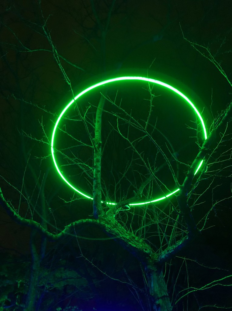
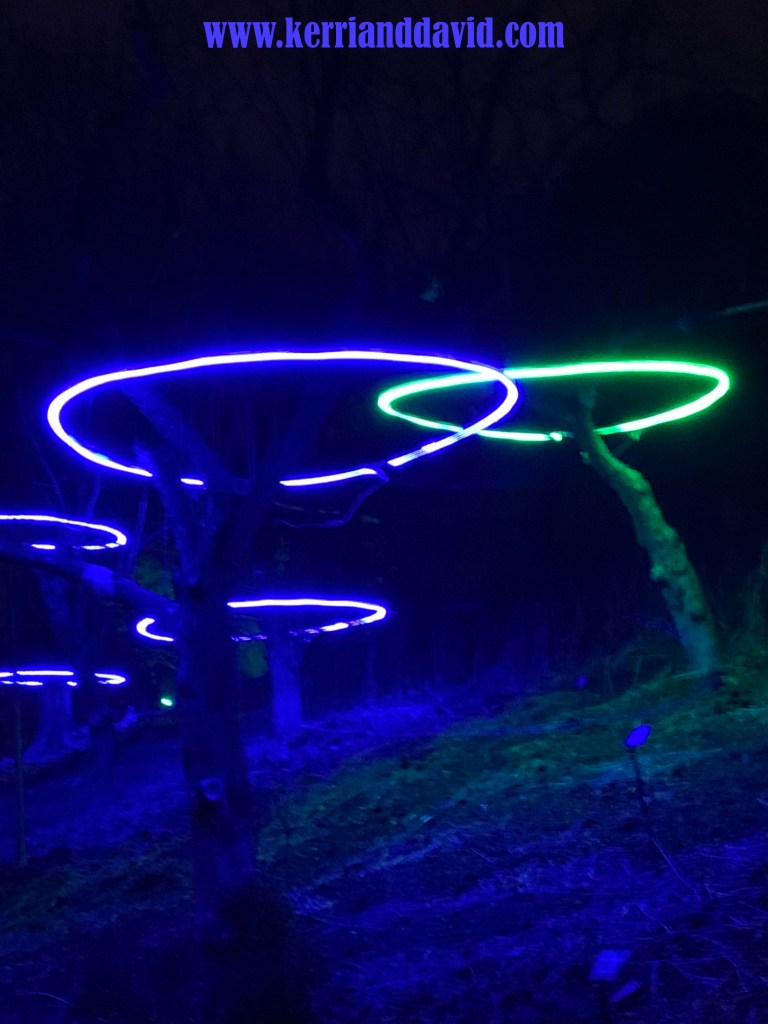
it would appear that a giant angel was hula-hooping in the clouds and dropped their hula hoop, which landed in the upper branches of a tree at the botanic garden. or, perhaps, that a spaceship -with no defined interior- had dropped down for a visit. or, maybe, there was a filming of sesame street’s “the letter ‘o'” about to do another take. brightly lit hula hoops of neon light suspended in trees, they cast an eerie glow onto the frozen ground, onto the path. michael bublé sang “walking in a winter wonderland” and we found ourselves inside the magic.

there is definitely something to wandering paths amongst many other people all oohing and ahhing. i had vowed to myself to leave my camera in my purse, but it wasn’t minutes before i failed at this. there were just so many colors and textures to remember, so dreamy. vast installations of creative lighting.

we had hoped to go. the ticket cost was a little prohibitive but we decided – when we woke and new year’s day was to be a little more mild than it had been – to splurge.

we were stunned even at the entrance to the garden, the trees wrapped in lights, every single branch and twig gleaming. we moseyed along the path, pulling over to let groups of people by so that we could be somewhat alone as we strolled.

but this wasn’t a silent and solitary hike in the woods. it was a performance piece we all took in together. each person’s glee added to ours and, dropping all expectations and all analysis of how-do-they-do-that, we were caught up in the captivating displays.

we already have a plan for next year. there are snacks and beverages and fire pits, places to linger, places to immerse. i could stand and watch the water and light “all i want for christmas” over and over and over. i allowed myself to wonder what a garden would look like lit to a piece of my own music.

we talked about our favorite displays driving the backroads. though spaceship fantasies are not my thing, hula hoops definitely are in my wheelhouse and the hulahooplights made my list. by the time we got home we realized that we had listed all of the displays we had seen, each design extraordinary, a celebration of the marriage of color and light and and sound and garden.

our late-night snack had a different air. the gift of being outside in the cold. the gift of beauty. the gift we had given ourselves – permission to splurge a little. a new year and its new intentions.

*****

read DAVID’S thoughts this TWO ARTISTS TUESDAY


1 Comment

up on the roof. [merely-a-thought monday]

adulting is hard.

this is not a new revelation.

it’s just a reinforcement of the obvious.

i’m caught in the onslaught of wistful; fall is here. and the on-and-on thoughts in the middle of the night include a zillion questions, all unanswered.

we took a walk in charlotte, on the way to a pedicure with my girl. i wanted to run to the door of the house-with-this-fence and hug the person who painted it.

where else can we be but where we are? marcel reminds us, “the real voyage of discovery consists, not in seeking new landscapes, but in having new eyes.”

today is our anniversary. it’s been seven years since we had seven days in a row of parties, were surrounded by family and friends for seven whole days. oh, to relish something like that again! daisies and food truck burgers, heaping plates of pasta and sweet potato fries, cupcakes and gluten-free brownies, bottles of wine from ann’s corner store. we picked pumpkins and danced on the patio and bonfired on the beach. it was a giant celebration and we reveled in it all.

in the middle of middle age we somehow found each other – across the country from each other. we both had been married before – to extraordinary people who have also found a beloved with whom to share life. we often ponder together the “had we been smarter, more capable, wiser” questions, but the “réview” mirror is not where we are going and here – in our 60s – it’s full-steam ahead. we feel fortunate. we are able to share our time together, our growing-old, our foibles and messes and the successes that brought us to now. this time hasn’t been a cakewalk. it sure hasn’t been fancy. coming together in middle age has its challenges and we have had a few extras tossed our way through these years. we sort through the weirds and stand in the wonder. and we know we are where we are supposed to be. maybe there is some sort of design in this universe.

20 gave us a card. like most of his cards, he made it for us. it reads, “love isn’t something that happens to us. it’s something we’re making together.”

tonight we are going to bring happy hour up on the roof. because the very first day of making-this-story-together-the-day-we-met-in-person, that’s where we sipped wine under blankets as the sun went down on a cool may day.

*****

read DAVID’S thoughts this MERELY-A-THOUGHT MONDAY


Leave a comment

sistered. [d.r. thursday]

the quiet is one of my favorite things each early morning. the world has not yet awakened, save for the birds. as the sun rose red into the sky today it was as if a silent movie was playing in the sky, strewn with color.

“stillness is the canvas against which movement can become beautiful. we can only appreciate movement against the background of stillness. were everything kinetic, we could not know what movement is. as sound is sistered to silence, movement is sistered to stillness.” (john o’donohue – beauty)

sistered.

it’s the rests that give meaning to the music – the breathing that makes owning a passage only yours.

it’s the white space that gives design power – balance revealing subject, a viewer’s ability to see.

it’s the negative between the positive – giving definition, directing eyes to move.

it’s the imperfection that accords perfection.

it’s standing still that makes dance dance.

it’s less words that gives impact to more words – wisdom is not measured in the verbose.

it’s dark that gives the stars life – a stage for shimmering pinpricks of light, gigantic close, tiny from afar.

it’s noise that makes the whisper worthy of delicious goosebumps.

it’s the tide going out, coming in that makes the waves, the low-tide sand pushing the wave higher.

it’s absence that reminds us of the potency of presence.

it’s sleep that gives energy to awakeness.

it’s dreams that give shape to reality.

it’s quiet – gentle hushed sunrising birdcall-punctuated quiet – that feeds the wearied cacophony in our minds as we start anew. offered with possibility, with crayons or colored pencils or thick oils to fill in our day, peeking into spaces of nothingness, seeing past what we see, coloring over the lines, entering the negative space, uncluttered and still.

sistered. beautiful.

*****

read DAVID’S thoughts this D.R. THURSDAY

visit DAVID’S gallery online


Leave a comment

“they really need to upgrade their font.” (merely-a-thought monday]

font

it runs in the family.  we are font-picky.   truth, we are font-obsessive.

when My Girl was younger and we would make a trip to the library, she would scan along the shelves.  with scorn she would scoff at titles – not because of the title, but because of the font used on the spine.  “it can’t be any good if they didn’t pay any attention to the font they used,” she’d dismissively roll her eyes.

i am known to go on and on about fonts.  d can tell you.  i am consistently surprised at how little regard is given to the chosen font in the delivery of a message – a title – a branding.  i am often heard saying, “what were they thinking?”  and when d can’t relate i text or show 20; i know he will join me in my rant.

we were recently walking in downtown chicago through the neighborhoods heading north with My Boy.  we passed by a barnes & noble.  glancing over, he derisively declared, “they really need to upgrade their font.”  i started laughing when i saw d’s face; i know he was thinking i’m surrounded by them, these font-fussy folks.  i couldn’t be prouder.

you have to admit though.  you have, at least a time or two, noticed a font and either thought, “wow! i love the way that looks!” or “yuck.  that doesn’t fit at all.”  you have been on a website where the front page boasts six or seven different fonts, all different colors, no continuity, no crispness.  yuck.  it’s a mishmash for your eyes and makes you quickly lose interest, likely the opposite of what the site was trying to encourage.

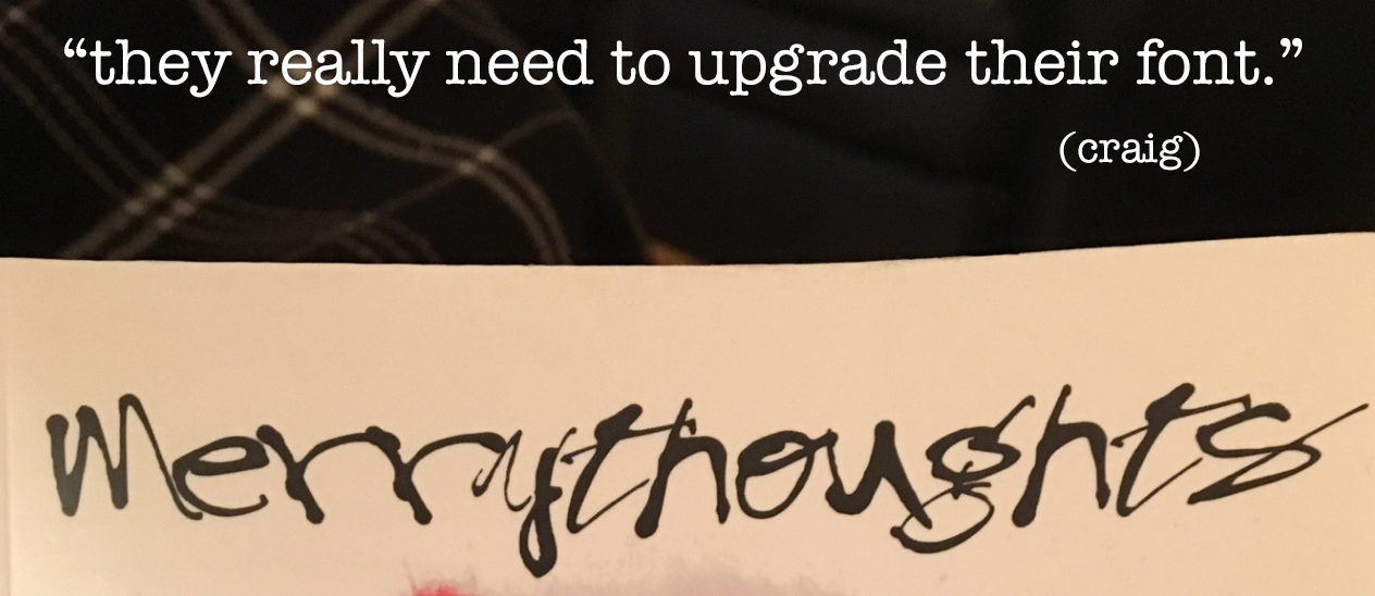
take the title in the image above.  a gift, it is literally the title of a book on one of my shelves.  offering no opinion on the book itself, i just want to say that based on the font for the title merry thoughts i never would have purchased it.  i mean, look at it!  does that look merry to you??  it looks more like a halloween font than any kind of merry font. is it sarcastic font?  is it tongue-in-cheek font?  hardly.  that font would have stopped me.  boom!  no purchase.   what were they thinking?

serifs. sans serif.  the kerning, the capitalization or lack thereof.  the use of punctuation. the color of the font.  overuse of italics.  bold style vs regular.  the amount of clean space.  etc. etc. etc.  all of it.  it all counts.

i love design.  inspired from years and years of watching and listening and learning and probably asking too many questions, sitting over the shoulders of 20 and justine as they worked on album covers and posters and such, i now love working on designing recognition around font or a certain ‘look’, fresh ideas for brands or organizations that seem dated or tired or just boring.  there is no shortage.  look around.  so many graphics.  so little attention to detail.  what are they thinking?

we are never bored driving across town, across the state, across the country.  there i am, in our giant-sign-laden-land, gesturing and ranting, pointing out the billboards with design-police diatribes.  “they really need to upgrade their font!” i announce.

read DAVID’S thoughts this MERELY-A-THOUGHT MONDAY

not our best morning minturn website box


Leave a comment

a morsel among many. [d.r. thursday]

PeaceOnEarth

i distinctly remember designing this.  for over a year i spent tons of time designing products:  pillows, tote bags, cellphone covers, prints, beach towels, cutting boards, mugs, travel cups, coasters, cards, shower curtains, side tables, leggings.  i would study david’s paintings and extract morsels and execute the process – with great joy – of the choosing of the product lines i wished to represent and the designing of those.  it was our intention to sell these pieces.  i would have absolutely loved to fill a brick and mortar store with these pillows and mugs and journals and tote bags, but the sheer outlay for merchandise and stock and the overhead for a physical store made that impossible.  but online – at an online storefront called society6.com, which would manufacture the pieces as they were ordered – it was possible.  it was a good premise.   so we opened five storefronts online (listed below in case you want to stop by with a cup of coffee) to represent each day of our studio melange postings.

only it didn’t really work.

hundreds, literally hundreds, of designs and thousands of products later, we decided it was time to stop putting the hours of effort into these designs.  we had some sales and it is truly a delight to see someone carrying a tote bag i designed or a laptop cover or to hear from someone who is enjoying their purchase.  the sales trickle in still, $4 here, $2.10 there.  the mark-up, as you would expect, lists mightily to the side of the host company, but we dreamed of great volume – so many pillows that earning a few dollars for each-one-of-many would be a big help to our working budget.

only it didn’t really work.

every now and then i visit these sites and am astounded at how actually cool the products are.  the designs aren’t so bad either, if i do say so myself.  (tee-hee)  there are some really beautiful pieces out there, like this PEACE. EARTH. PEACE ON EARTH. morsel.  simple and profound.  timely.  if you click here, you can see it as a pillow.  if you scroll way down on that linked page, you can see all the other products that we designed and made available with this image.  it was within the painting INSTRUMENT OF PEACE that i found this morsel.

even though it didn’t really work, i suppose it worked.  because i can’t begin to tell you how much i learned.  maybe that’s the point.  maybe that’s always the point.

InstrumentofPeace copy

for more morsels of david’s paintings, click here:

www.society6.com/davidrobinson

for various designs of mine, click here:

www.society6.com/kerrisherwood

for products with photographs or graphic designs or inspiring messages, click here:

www.society6.com/twoartists

for products with our beloved cartoon chicken marsala, click here:

www.society6.com/chickenmarsala

for products that make you laugh, images of our flawed cartoon, click here:

www.society6.com/flawedcartoon

and for david’s online gallery of paintings, click here:

Screen Shot 2019-10-02 at 4.09.09 PM

read DAVID’S thoughts this D.R. THURSDAY

their palettes website box

INSTRUMENT OF PEACE/PEACE.ON.EARTH © 2015 david robinson


Leave a comment

blueprint for my soul. [k.s. friday]

bp box

BLUEPRINT FOR MY SOUL was my second album.  it followed on the heels of RELEASED FROM THE HEART, just a short year later.  RFTH wasn’t my first recording.  back in the late 70’s i recorded three songs in ny, all vocal songs.  i toted those, to no avail, around nashville’s music row,  along with a few others that i had penned and recorded in the mid 80’s.  but things don’t always happen in our own timing, nor do they happen the exact way we envision them.  architects use pencils with erasers for a reason.

fast forward a few years.  well a decade, actually.  the story behind the story, which i told in my 19 years ago today post (written five years ago now) is a story of the blueprint…the one we can’t see.  we seek out what we think we want, we pray unceasingly for that thing we are hyper-focused on, we worry and wring our hands, trying to force IT to happen.  (ask us.  we can speak to this.)

but sometimes what we think we want isn’t what we are really seeking.  and sometimes unanswered prayers are a gift.  and sometimes worry will just beget more worry and anxiety will just make you miserable.

the blueprint, the design, the plan.  all with options.  all with freedom of choice.  mostly, all, thank goodness, with grace.  those pencils with erasers come in handy.

“sometimes people and things have an obvious fit with you.” (liner notes, track 2)

download BLUEPRINT FOR MY SOUL on iTUNES or CDBaby

read DAVID’S thoughts this K.S. FRIDAY

BootsWeddingBoots website box copy

BLUEPRINT FOR MY SOUL from BLUEPRINT FOR MY SOUL ©️ 1996 kerri sherwood


Leave a comment

a matter of perspective. [two artists tuesday]

skewed -framed copy

corrugated metal.  i have a thing about it.  i have a thing about texture.  and a thing about capturing texture on film.  i love design and white space and fonts, simplicity and the challenge of balance.  this image started with the side of a building against clean snow.  i felt (and still feel) connected to this building and what it represented, so its texture is beautiful to me; the image both inspires and saddens me.  an experiment in contrast and point of view, it may be hard for a viewer to discern what the original pure image might have been.  manipulating it, changing what the viewer would see is simply an orchestration of color and space, light and dark, angle and edge, point and counterpoint (melody) lines.  skewing it changes the emotional response; although it remains fundamentally the same, it becomes something slightly different and is seen through a different lens.  it’s all a matter of perspective.

how we look at anything.  how we see anything.  how the pieces come together, how we view them, how we sort, how we sometimes have to let go.  it’s all a matter of perspective.

read DAVID’S thoughts this TWO ARTISTS TUESDAY

footprints in the snow at bristol woods website box

SKEWED ©️ 2019 kerri sherwood & david robinson


Leave a comment

feeling it. life. [two artists tuesday]

MelangeWk1 copy 2

in the beginning…..

i just re-read the first week of our MELANGE, a calendar-year ago now.  words about our little boy CHICKEN MARSALA, words spoken by my sweet momma, words about our community, words about david’s studio and my studio, two artists living together, and our own work-in-the-world.  i can feel it.  that first week.

we come to this place.  one year later.  i kind of want to go back and re-read each day.  study the images we chose, browse the products we created, watch the arc of changes in design through the year, notice the growth, the things we added, the things we let fall off.  somewhere around week 3 i wondered if i would have enough to say, enough words that would be interesting or, at-the-very-least, palatable, inviting for others to read.

i write from my heart, most of it experiential…moments i have netted and captured, written down to hold onto the feeling-of-it.  i wondered if that might be too….much…for some.  in the middle of living life, i want to remember some of the tiniest morsels of time, layered in the sedimentary layers, bits of shining mica in the middle of ordinary….mica that is celebration, that is eye-opening, that is excruciatingly simple bliss,  that is painful, that is full of maturing, that is on-the-edge-of-your-seat-nerve-wracking, that is full of hopes and dreams and regrets…all mica indeed.

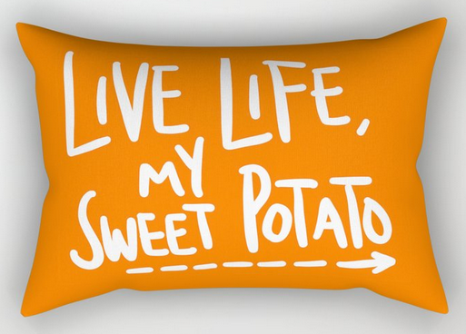
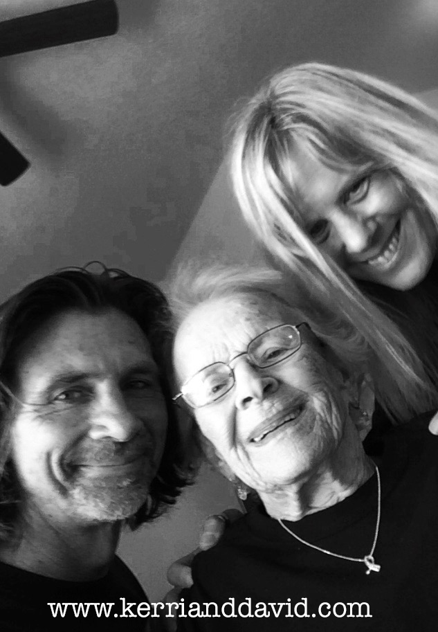
“live life, my sweet potato,” my sweet momma said to me.  yes, momma.  this sweet potato is feeling it.

live life sweet potato mug

live life sweet potato pillow

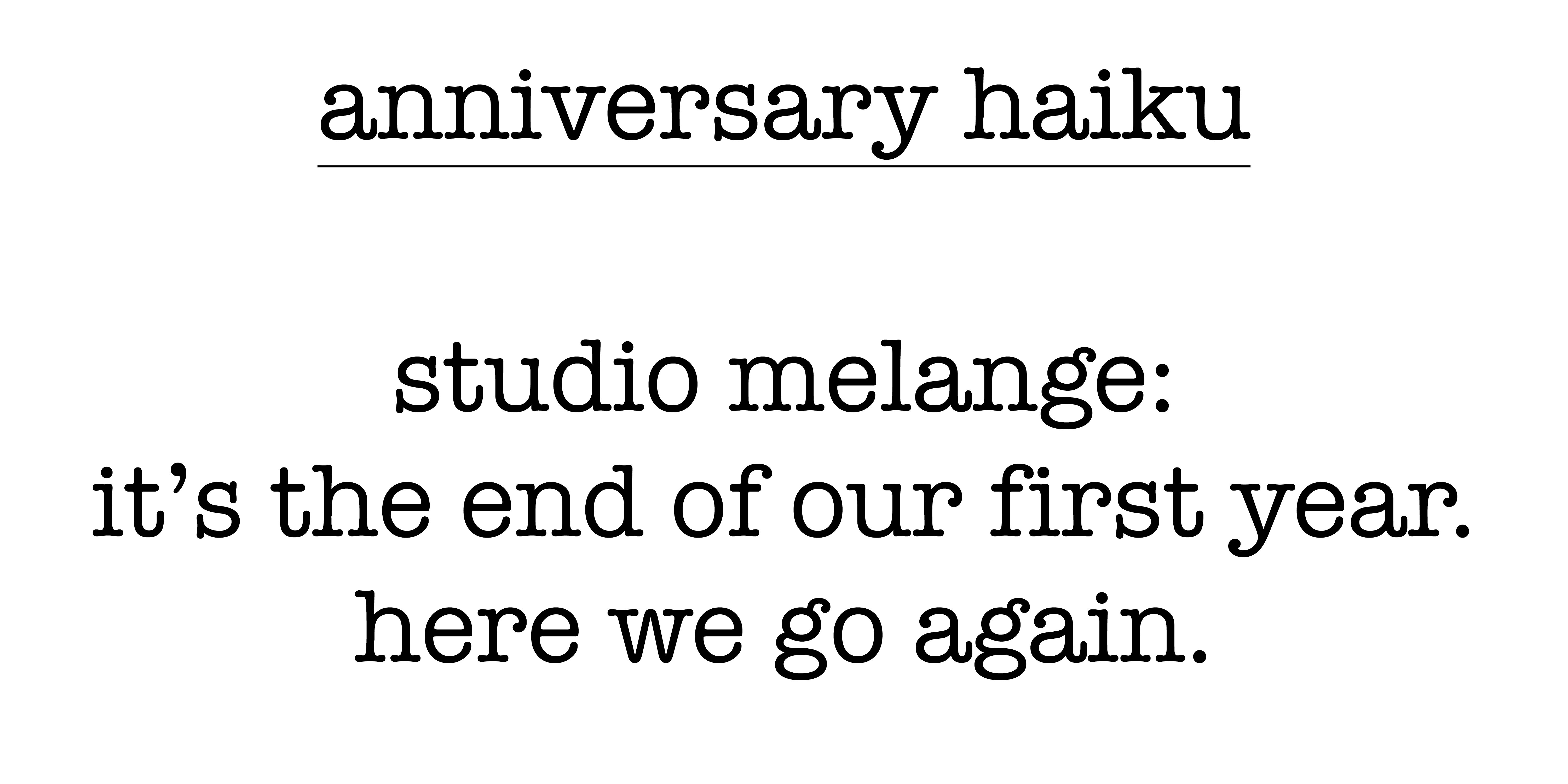
anniversary haiku copy

read DAVID’S thoughts about this ANNIVERSARY MELANGE TWO ARTISTS TUESDAY

if you'd like to see TWO ARTISTS copy

momma, d & k website box

TWO ARTISTS DESIGNS ©️ 2016 david robinson & kerri sherwood


2 Comments

pick a tissue box. [two artists tuesday]

tissue box copy

i am difficult in the facial tissue aisle.

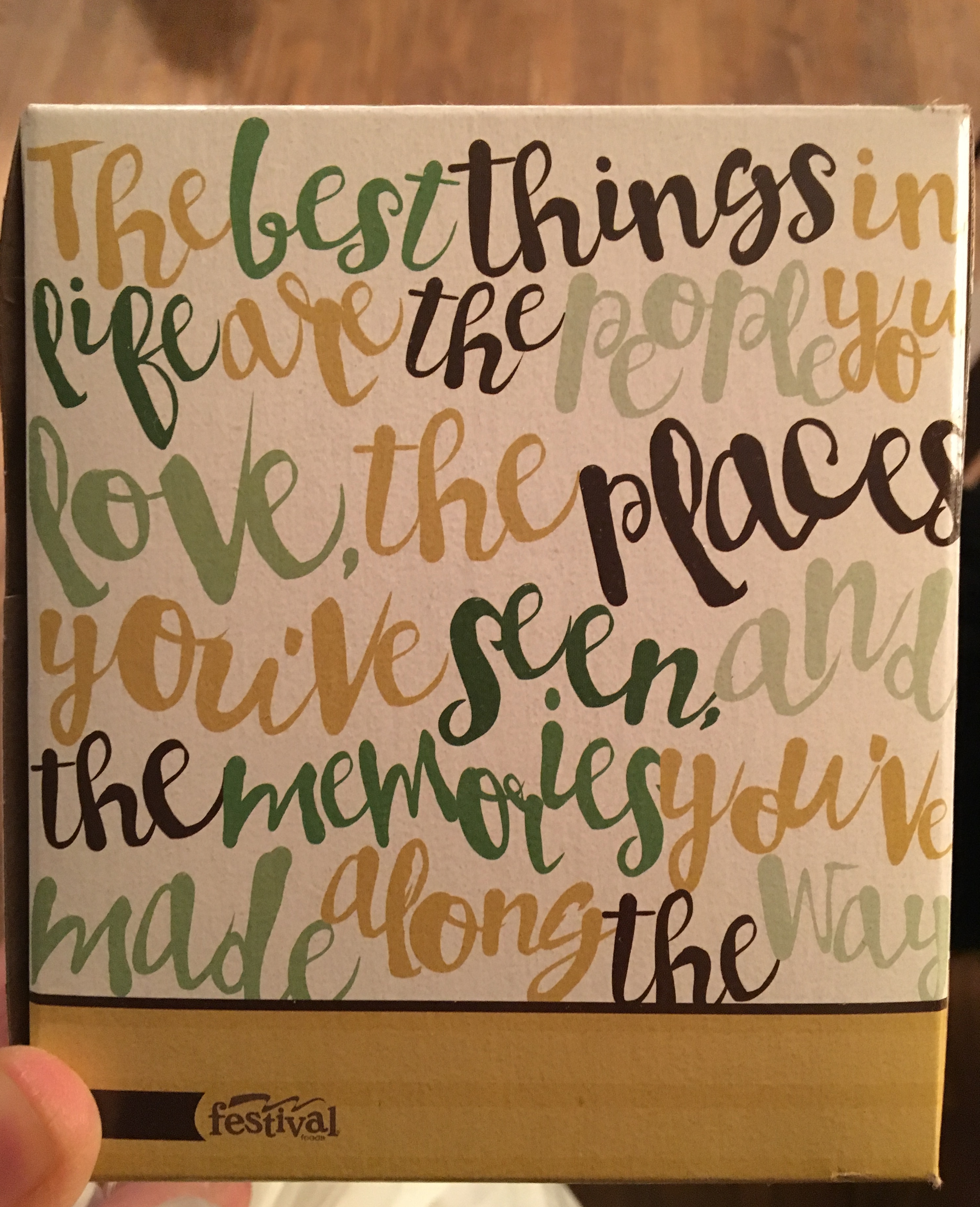
it seriously makes me cringe looking at the little square boxes of tissues (the size that will appropriately fit in our bathroom.)  most of them, in my humble opinion, are ugly.  i wonder who designs these boxes and i wonder why anyone purchases them who doesn’t have one of those crocheted-tissue-box-covers that you could purchase at any church bazaar in the 90s.  (we don’t have one of those.)  the color choices, the patterns (or i should say the lack thereof) are really disconcerting to me.  someone is clearly getting paid to design them and they are dull and uninspired.  target used to have a solid-color-series of tissue boxes; maybe they still do somewhere, but it isn’t at our target location.  choosing a solid color is much better than a pale-skin-tone-dot-pattern-on-cool-light-beige box.  i mean, really?  i suppose if you want your tissue box to blend in with the environment that would overly-work, but what if you want your tissue box to be a statement piece?  or at least be attractive?

so by now you are rolling your eyes at this, a clear first-world-problem-meaningless-rant.  and i understand that.  but my question remains…a question i quite often wonder about with many different products…who designs this stuff?

we were at festival recently (one of our grocery stores) and stumbled across this tissue box.  we purchased this one.  although the band of mustard gold at the bottom edge with advertising seems unnecessary, the font is mostly acceptable, the colors are not simply muted non-shades.  and the saying is a good, albeit trite, every-time-you-are-in-the-bathroom reminder, “the best things in life are the people you love, the places you’ve seen and the memories you’ve made along the way.” 

i don’t suppose everyone ponders tissue boxes.  but two artists living in the same household pretty much ponder everything that will sit out in view.  although i have to admit, david is not as zealously-picky about tissue boxes as i am.   maybe, just maybe, i should have been a tissue-box-designer.  or maybe i was one in a former life.  either way, it makes me a critical-kleenex-consumer.

read DAVID’S thoughts this TWO ARTISTS TUESDAY

wideopenmouths website box copy


Leave a comment

pillow-paintings. [two artists tuesday]

pillow collage - d paintings

we have bought our share of throw pillows. different fabrics and patterns from target, from department stores, they have been at various price points.  and they are great accent pieces on the couch or the wicker chair where we are hiding the wicker that babycat has torn off with the combination of a throw blanket and throw pillow (of course, if you see the chair from the back, it’s pretty clear what has happened there.)

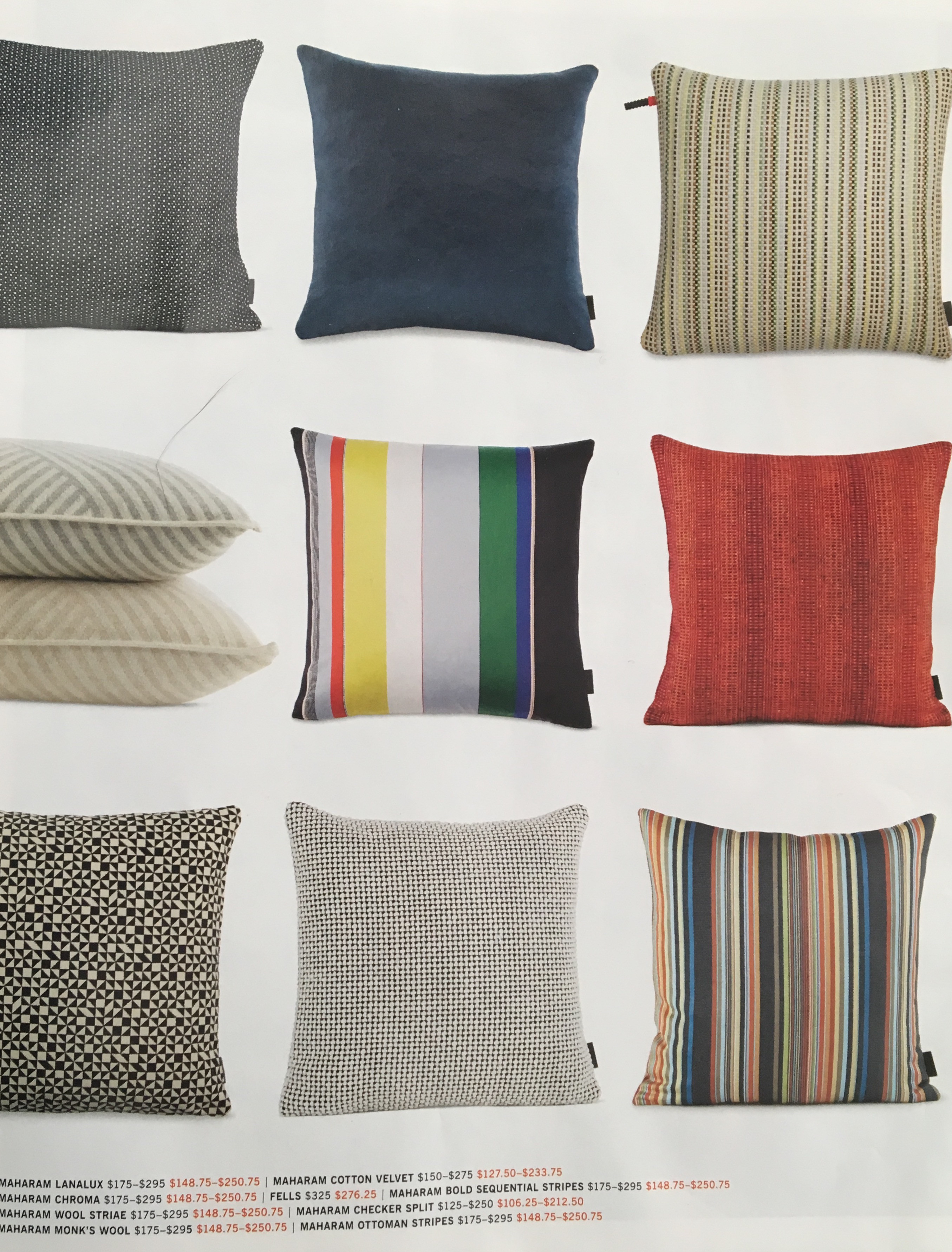
recently, the newest design within reach catalog arrived.  now, that is a great catalog.  clean lines, a store (brick and mortar as well as catalog and online presence) that is dedicated to their designers and design services.  so the “design” part of their name i agree with.  it’s the “within reach” part that gets me.  i flipped through the catalog, admiring the white space and the simple fonts, the brief snippet stories about their designers, and came to pages 50 and 51.  six columns of throw pillows greeted me across the spread and a “save 15% during the living room sale.”

designs within reach

catalog page

the pillows ranged (retail price, without the sale) from $95 up to $295.  at this point in our life, it’s not in our budget to spend even $95-15%=$80.75 on a throw pillow.  yes, i grant you that there are people who absolutely can afford that.  but i must say, that on the day i wouldn’t have to think twice about a $295 throw pillow, it would have to be hand-painted by our (potential) grandchild for me to buy it.


when i have been working on the designs for products that are inspired by david’s paintings, i have been aware of and have worried about the pricing.  (that is something we think about a lot for those people who are interested in purchasing these designs and other products that are printed on demand – one at a time.)  on the society6.com site, throw pillows range from $29.99-$44.99 for indoor pillows or outdoor pillows for your deck or patio.  with their often 30% off sale, it brings that down to about $21-32.  i mention all these specifics because those prices seem more “within reach” to me, and not mass-produced or mass-marketed through a large company.  it is entirely possible to have the only pillow in the world with the design you have chosen.  but, that is also the peril of many artists – the inability to reach the masses.

even with however cool it is to say that you own a design within reach throw pillow, i just want to say that each time i see one of the rendered pillows with the chosen david-painting-morsel on it, i have wanted to purchase it, put the pillow-painting on our couch and show others that beautiful art doesn’t just have to be on the wall.

and so, with the arrival of new catalogs as fall shopping approaches, i thought a pillow collage was in order – just in case you missed the pillows along the way.  besides, if design within reach can do a throw-pillow-collage, so can i.  😉

to view david’s painting morsel throw pillows, click on the black box above or click here

to view the artwork that inspired these pillows, click here to visit the gallery

read DAVID’S thoughts on this TWO ARTISTS TUESDAY

TWO ARTISTS TUESDAY – ON OUR SITE

pillows ©️ 2018 david robinson & kerri sherwood