post-burlap-tan-horse-stall-chic bedroom decor, my room became a giant smile face. flowers and smileys everywhere, playing white and yellow with an orange shag rug. i had a giant smiley face poster on my door; beware to the grumpygus who might enter. smile or don’t come in!
the smiley face – “invented” in 1963 (when i was merely 4) was a morale booster developed by the designer harvey ball for the employees of an insurance company. the staying power of that simple icon is amazing! like the nike swoosh, developed by graphic-student-at-the-time-carolyn davidson (who, incidentally was paid a whopping $35), it has endured. it is, i’m sure, every graphic designer’s dream to come up with something so simple, so recognizable and so defining of a company or a product or an initiative. less is more.
many years ago i sat in my studio at my piano on speakerphone. one of the sales teams at astrazeneca was on the other end of the phone, their products – breast cancer pharmaceuticals. the team was passionately raising awareness and pursuing new and established launches. the astrazeneca team was working on a trademark – “in your corner” – and, having done much performance work in the oncological world, with many pharma companies, and with astrazeneca, i had written a song for them. it was in the earlier 2000s and speaker phone was the best we could do. after greeting everyone i played simple, straightforward lyrics, potent and direct, a simple catchy melody. less is more. the team loved it.
nothing ever came of that song. much like any pitching designer – whether graphic or product vision statement or slogan or logo or fashion or music or jingle – can tell you, more ideas are shelved than ever make it past the cutting floor. but somehow the cleanest ones sometimes make it through. my favorite designs are often the simplest gestures. my favorite songs are often the simplest melodies. my favorite fashions – yes, yes, i know i am not a fashionista – are the simplest clothes.
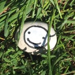
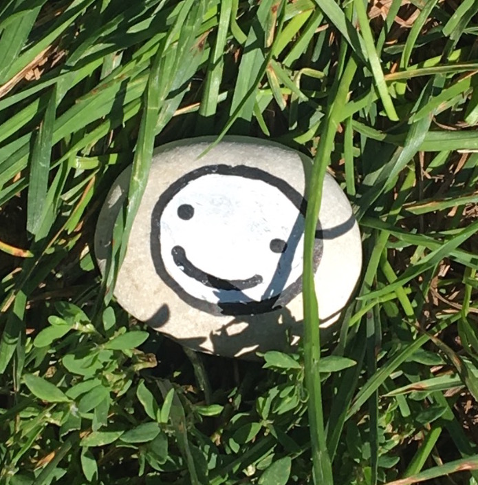
we walked along the lakefront past the beach where folks had set up umbrellas and small beach canopies, beach towels and plastic pails, picnic baskets and, off to the side, grills. so much happy. as we left the park and glanced down to turn onto the street sidewalk, there it was. this rock, painted with a happy smiley face. its simplicity made it noticeable. less is more, tucked into the grass next to the sidewalk.
there is nothing quite as appealing as someone smiling at you. during this time of covid and mask-wearing, that has been a missing link. we pass by others and the simple gesture, which so often sets the tone in an exchange, is awol, hidden under very-important-pandemic-masks. and so, we don’t know. there have been times when, not certain if my eyes are telling the story, i have literally said aloud, “i’m smiling under here.” the smiley-laughing face emoji is the most universally used. people want others to know they are smiling, laughing. that someone else’s presence or words or antics have made them smile or laugh. a happy face tells them that. simple. more.
we left the rock where we saw it. i can’t imagine how many people smiled as they passed it by. kudos to the artist who, with all the colors in the palette, chose to pick black and white and paint a simple smiley face.
*****
read DAVID’S thoughts this NOT-SO-FLAWED WEDNESDAY

