reverse threading

the path back is the path forward


Leave a comment

readers. [saturday morning smack-dab]

i wear one contact. in my left eye. though i can actually see distance, it helps me see cleeearly – you know, defines the lines a little bit more, makes all the signs crisp. my right eye – sans contact – sees up close. and somehow, for the most part, my brain figures this out.

so i can usually see. most stuff.

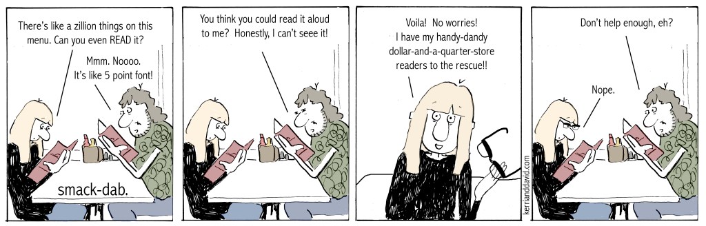
but there are times. and – even with the great squint – the greatest squinty squint – i can’t read. like the ingredients on the bbq sauce at the grocery store or the directions for use on the new cleaning product. or the dang menu. in the tiniest font ever is printed all the potential meals we could ever desire…if only we could read them.

there’s always a pair of readers – the cheap kind that came from the dollar-and-a-quarter-store-that-used-to-be-the-dollar-store (does ANYthing EVER stay the same???). but they could be 1.25s. or maybe 1.5s. and there are fonts out there in the world that require flippin’ 2.5s. i know you can relate.

we have this clay bowl in our sunroom. in it are about thirteen pairs of readers. a baker’s dozen. and we have readers tucked into the side doors of littlebabyscion and big red. and we have readers right outside the kitchen hanging on the same hook as the key basket. and we have readers upstairs on the drafting table in the office. and there are readers – yes, yes – next to the bed.

we went into a newly revamped shop in our town a few days ago. lovely. so many nice products. and the proverbial rounder – the one with all the fancypants readers. they are cute-cute-cute!! i was tempted to try some on. but instead, i passed by. $24.99 was pricier than readers-to-add-to-the-bowl can be for me.

besides, i kind of think menus should come with readers attached. or maybe a magnifying glass. a little less ego-bruising.

*****

read DAVID’S thoughts this SATURDAY MORNING

SMACK-DAB. ©️ 2023 kerrianddavid.com

www.buymeacoffee.com – a link or this QR code- if you would like to help support SMACK-DAB


Leave a comment

“they really need to upgrade their font.” (merely-a-thought monday]

font

it runs in the family.  we are font-picky.   truth, we are font-obsessive.

when My Girl was younger and we would make a trip to the library, she would scan along the shelves.  with scorn she would scoff at titles – not because of the title, but because of the font used on the spine.  “it can’t be any good if they didn’t pay any attention to the font they used,” she’d dismissively roll her eyes.

i am known to go on and on about fonts.  d can tell you.  i am consistently surprised at how little regard is given to the chosen font in the delivery of a message – a title – a branding.  i am often heard saying, “what were they thinking?”  and when d can’t relate i text or show 20; i know he will join me in my rant.

we were recently walking in downtown chicago through the neighborhoods heading north with My Boy.  we passed by a barnes & noble.  glancing over, he derisively declared, “they really need to upgrade their font.”  i started laughing when i saw d’s face; i know he was thinking i’m surrounded by them, these font-fussy folks.  i couldn’t be prouder.

you have to admit though.  you have, at least a time or two, noticed a font and either thought, “wow! i love the way that looks!” or “yuck.  that doesn’t fit at all.”  you have been on a website where the front page boasts six or seven different fonts, all different colors, no continuity, no crispness.  yuck.  it’s a mishmash for your eyes and makes you quickly lose interest, likely the opposite of what the site was trying to encourage.

take the title in the image above.  a gift, it is literally the title of a book on one of my shelves.  offering no opinion on the book itself, i just want to say that based on the font for the title merry thoughts i never would have purchased it.  i mean, look at it!  does that look merry to you??  it looks more like a halloween font than any kind of merry font. is it sarcastic font?  is it tongue-in-cheek font?  hardly.  that font would have stopped me.  boom!  no purchase.   what were they thinking?

serifs. sans serif.  the kerning, the capitalization or lack thereof.  the use of punctuation. the color of the font.  overuse of italics.  bold style vs regular.  the amount of clean space.  etc. etc. etc.  all of it.  it all counts.

i love design.  inspired from years and years of watching and listening and learning and probably asking too many questions, sitting over the shoulders of 20 and justine as they worked on album covers and posters and such, i now love working on designing recognition around font or a certain ‘look’, fresh ideas for brands or organizations that seem dated or tired or just boring.  there is no shortage.  look around.  so many graphics.  so little attention to detail.  what are they thinking?

we are never bored driving across town, across the state, across the country.  there i am, in our giant-sign-laden-land, gesturing and ranting, pointing out the billboards with design-police diatribes.  “they really need to upgrade their font!” i announce.

read DAVID’S thoughts this MERELY-A-THOUGHT MONDAY

not our best morning minturn website box