“we are also naturally-occurring, with no artificial preservatives, no added nitrates or nitrites,” one of the paragraphs of our cover letter read.
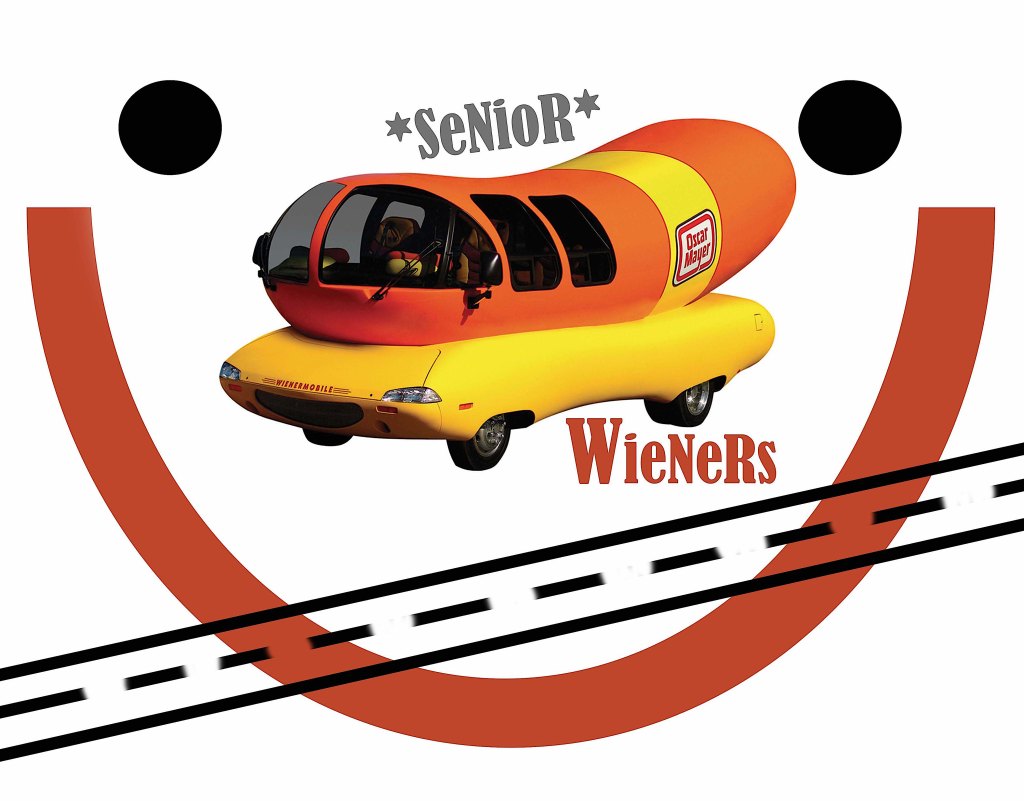
“we wanna be hotdoggers” we wrote in the subject line to the oscar mayer folks, who were looking for the 2021 wienermobile navigators. we fit the bill – creative, outgoing, friendly, enthusiastic, exuberant college graduates with an appetite for adventure, willing to see the country through the windshield of the oscar mayer wienermobile.
with new products aimed at —clearly, us— the corporate giant had reintroduced bacon back into our lives. a new bacon – with no added nitrates or nitrites. a bacon that is healthy. a bacon you can eat any old time. a bacon you don’t have to sacrifice from your diet. because…i LOVE bacon. really. love it. but. sigh.
they have other products along these lines as well…think: HOT DOGS…products that conjure up images of big family gatherings and parks and barbecues and wiffleball games and apple pie. a multi-generational rejuvenation unifying the country. we were up for it.
but we were not 22.
nope. we are a tad bit older. and so, we conceived a whole premise for them, a marketing strategy, a grand idea, partnering opportunities, designs and events. and we applied…because why not?
“SENIOR WIENERS” we proposed to their “HOTDOGGER” call. what’s not to love about SENIOR WIENERS for a company that wants to embrace change, a parent company (kraft heinz) that “hires and grows from diverse backgrounds and perspectives”?!
welp, we’ll never know.
though we couldabeen hotdoggin’ around the country for them, they never even called us. not even for a bit part.
they don’t know what they’re missing.
kerri & david play and sing the SENIOR WIENER song
post-burlap-tan-horse-stall-chic bedroom decor, my room became a giant smile face. flowers and smileys everywhere, playing white and yellow with an orange shag rug. i had a giant smiley face poster on my door; beware to the grumpygus who might enter. smile or don’t come in!
the smiley face – “invented” in 1963 (when i was merely 4) was a morale booster developed by the designer harvey ball for the employees of an insurance company. the staying power of that simple icon is amazing! like the nike swoosh, developed by graphic-student-at-the-time-carolyn davidson (who, incidentally was paid a whopping $35), it has endured. it is, i’m sure, every graphic designer’s dream to come up with something so simple, so recognizable and so defining of a company or a product or an initiative. less is more.
many years ago i sat in my studio at my piano on speakerphone. one of the sales teams at astrazeneca was on the other end of the phone, their products – breast cancer pharmaceuticals. the team was passionately raising awareness and pursuing new and established launches. the astrazeneca team was working on a trademark – “in your corner” – and, having done much performance work in the oncological world, with many pharma companies, and with astrazeneca, i had written a song for them. it was in the earlier 2000s and speaker phone was the best we could do. after greeting everyone i played simple, straightforward lyrics, potent and direct, a simple catchy melody. less is more. the team loved it.
nothing ever came of that song. much like any pitching designer – whether graphic or product vision statement or slogan or logo or fashion or music or jingle – can tell you, more ideas are shelved than ever make it past the cutting floor. but somehow the cleanest ones sometimes make it through. my favorite designs are often the simplest gestures. my favorite songs are often the simplest melodies. my favorite fashions – yes, yes, i know i am not a fashionista – are the simplest clothes.
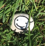
we walked along the lakefront past the beach where folks had set up umbrellas and small beach canopies, beach towels and plastic pails, picnic baskets and, off to the side, grills. so much happy. as we left the park and glanced down to turn onto the street sidewalk, there it was. this rock, painted with a happy smiley face. its simplicity made it noticeable. less is more, tucked into the grass next to the sidewalk.
there is nothing quite as appealing as someone smiling at you. during this time of covid and mask-wearing, that has been a missing link. we pass by others and the simple gesture, which so often sets the tone in an exchange, is awol, hidden under very-important-pandemic-masks. and so, we don’t know. there have been times when, not certain if my eyes are telling the story, i have literally said aloud, “i’m smiling under here.” the smiley-laughing face emoji is the most universally used. people want others to know they are smiling, laughing. that someone else’s presence or words or antics have made them smile or laugh. a happy face tells them that. simple. more.
we left the rock where we saw it. i can’t imagine how many people smiled as they passed it by. kudos to the artist who, with all the colors in the palette, chose to pick black and white and paint a simple smiley face.
we have bought our share of throw pillows. different fabrics and patterns from target, from department stores, they have been at various price points. and they are great accent pieces on the couch or the wicker chair where we are hiding the wicker that babycat has torn off with the combination of a throw blanket and throw pillow (of course, if you see the chair from the back, it’s pretty clear what has happened there.)
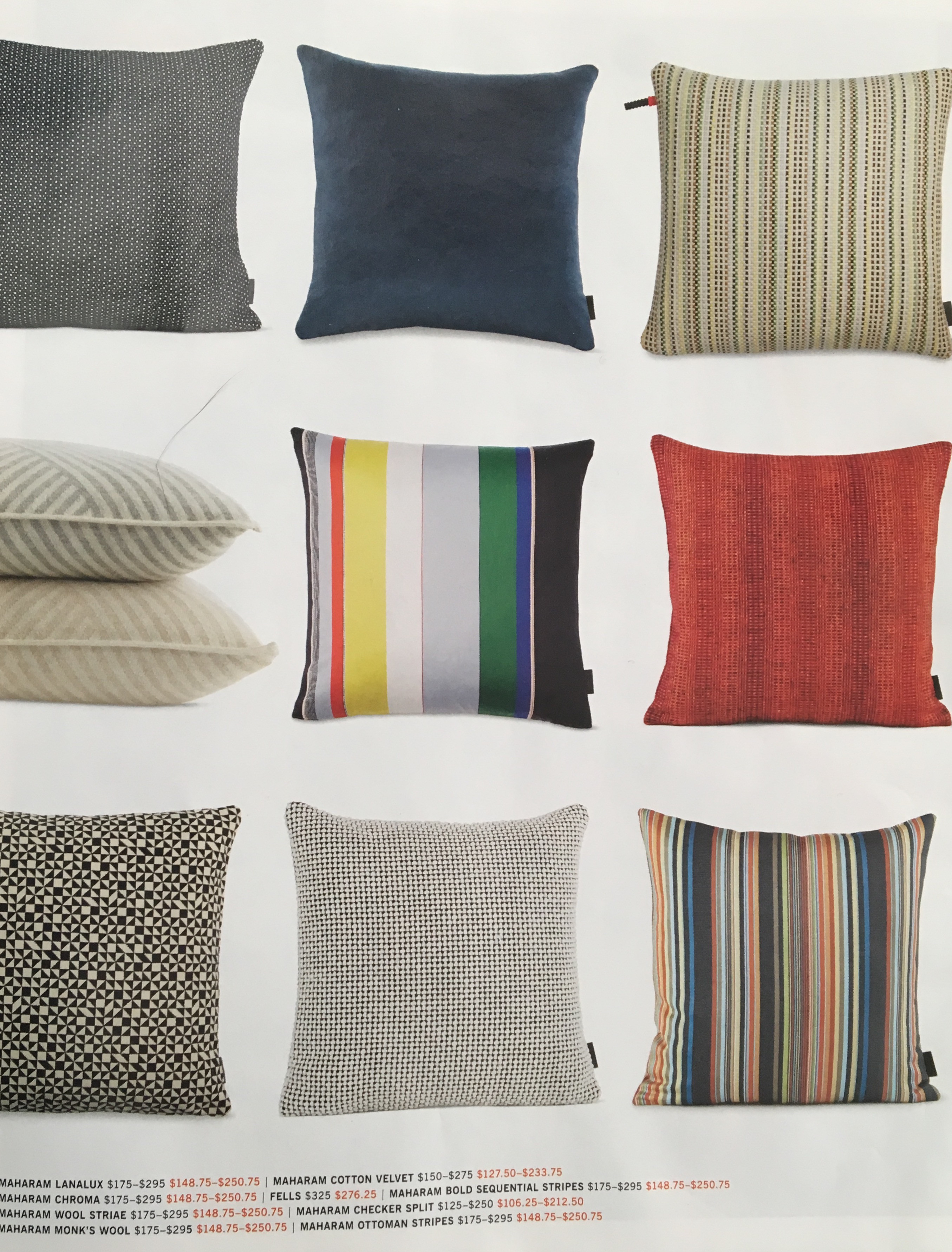
recently, the newest design within reach catalog arrived. now, that is a great catalog. clean lines, a store (brick and mortar as well as catalog and online presence) that is dedicated to their designers and design services. so the “design” part of their name i agree with. it’s the “within reach” part that gets me. i flipped through the catalog, admiring the white space and the simple fonts, the brief snippet stories about their designers, and came to pages 50 and 51. six columns of throw pillows greeted me across the spread and a “save 15% during the living room sale.”
catalog page
the pillows ranged (retail price, without the sale) from $95 up to $295. at this point in our life, it’s not in our budget to spend even $95-15%=$80.75 on a throw pillow. yes, i grant you that there are people who absolutely can afford that. but i must say, that on the day i wouldn’t have to think twice about a $295 throw pillow, it would have to be hand-painted by our (potential) grandchild for me to buy it.
when i have been working on the designs for products that are inspired by david’s paintings, i have been aware of and have worried about the pricing. (that is something we think about a lot for those people who are interested in purchasing these designs and other products that are printed on demand – one at a time.) on the society6.com site, throw pillows range from $29.99-$44.99 for indoor pillows or outdoor pillows for your deck or patio. with their often 30% off sale, it brings that down to about $21-32. i mention all these specifics because those prices seem more “within reach” to me, and not mass-produced or mass-marketed through a large company. it is entirely possible to have the only pillow in the world with the design you have chosen. but, that is also the peril of many artists – the inability to reach the masses.
even with however cool it is to say that you own a design within reach throw pillow, i just want to say that each time i see one of the rendered pillows with the chosen david-painting-morsel on it, i have wanted to purchase it, put the pillow-painting on our couch and show others that beautiful art doesn’t just have to be on the wall.
and so, with the arrival of new catalogs as fall shopping approaches, i thought a pillow collage was in order – just in case you missed the pillows along the way. besides, if design within reach can do a throw-pillow-collage, so can i. 😉