
a full box of crayolas at my side, i, too, in my itty-bitty chair at the itty-bitty table, would outline the image on the coloring book page and then color it all in. like there was some artistic reason for outlining – making a definitive and clear break between the image and the background. for a non-artistic-in-the-sense-of-drawing type, it seemed to make my coloring page look better, cleaner, more striking. i’m not really sure. but it was a popular thing to do – this outlining thing – and, though i don’t know who initially suggested it, nearly everyone colored their pages that way. you could see it on the ever-important bulletin board wall.
if i were to pick up a coloring book and crayons now i might even just fall back into old patterns, grasping the crayola stub in my hand tightly, pursing my lips and concentrating on not drawing off the line. then i would color it all in – in the lines – and my page would be neat and tidy and whatever other adjective might apply, synonymous with success.
when i color in “adult-colored-pencil-coloring-books” i have found that i don’t do this – i just color with my pointy pencils – no outlines, no outlining. is it the difference between the paraffin wax/powdered color pigment combo of crayons and the pigments/binding agents/fillers/casing used in pencils? is it some leftover art lesson from elementary school – where the emphasis was on some sort of impossible sought-after perfection for our coloring sheets? and why – knowing me – did i not color out of the lines? well, i can answer that one. back then i was an in-the-lines colorer, going with the crowd, hoping to get my picture on the bulletin board wall.
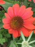
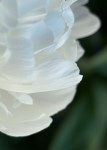
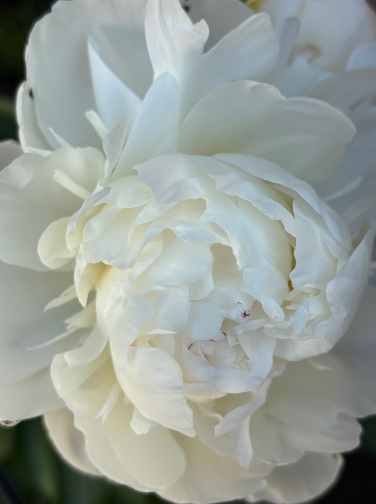
i move up close to the peonies in our garden out back. they stand their ground as i move around, right in their little peony faces, alternately snapping photos and taking big whiffs of their intoxicating scent.
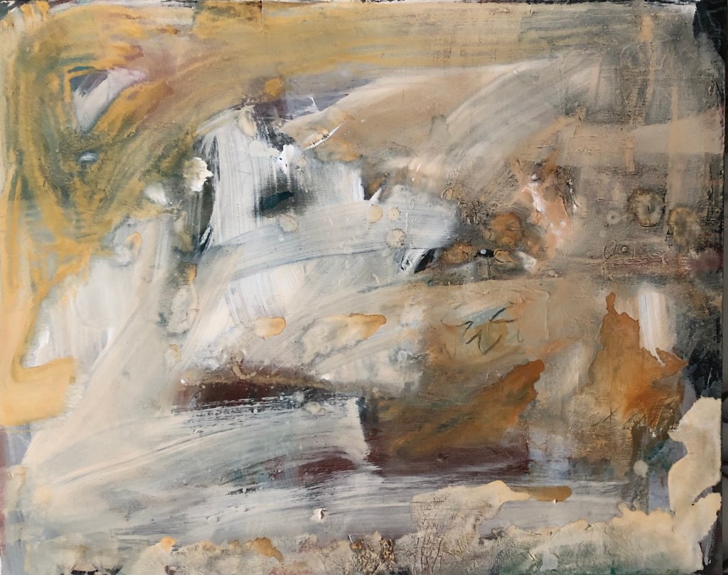
there are no outlines here. everything up this close blurs as my depth of field changes, my point of focus changes, my intent changes.
were i to make this photograph a coloring sheet – an accurate coloring sheet – it would require fuzzy lines – no clear outline – instead, a fade of one color into the next, maybe difficult to capture with a stub of crayon looking to make something definitive.
but life is more like that. less definitive, more fuzzy. it is less distinct and more out-of-focus. it is less green and white, and more grey. there are no outlines and, if you really get it, there’s no ever-important bulletin-board-wall upon which to hang up your life.
it just is.
and the moments we get to sniff peonies or color out of the lines, to allow the unfocused to swirl around us, to not get all caught up in the bulletin-board-wall – those are the moments to grasp, to hold onto, to store away as balm for those other moments – the ones that test us, that hand us crayons with impossible confidence-taxing expectations, that, somehow, in all the chaos, make us forget that peonies exist. craziness.
and so, no outlines. just color.
“…you write about my flower as if i think and see what YOU think and see of the flower – and i don’t.” (georgia o’keeffe)
*****
read DAVID’s thoughts this D.R. THURSDAY
like. subscribe. share. support. comment. – thank you. xoxo